Newskit design system
NewsKit design system
NewsKit design system
I worked as the senior UI designer on the NewsKit design system starting my involvement from the very beginning and having a pivotal role in the direction, evolution and growth of the system.

What's NewsKit?
What's NewsKit?
What's NewsKit?
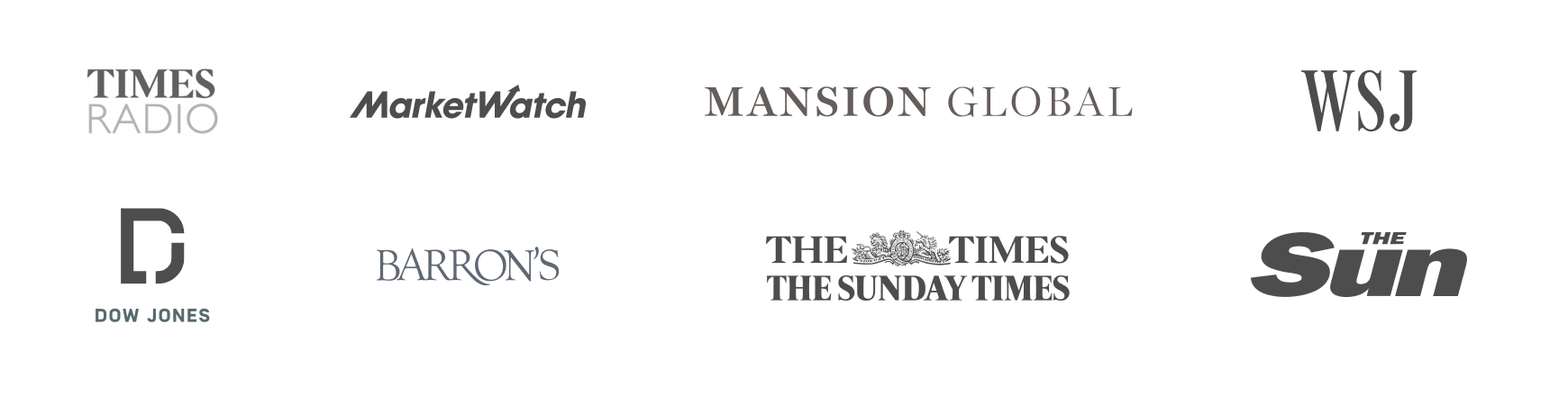
NewsKit serves as a design system that empowers media and broadcasting brands within the News Corp network.
In the UK, it caters to renowned brands such as The Times, The Sunday Times, and The Sun. In the US, NewsKit forms the essential framework for Dow Jones, supporting prominent websites like the Wall Street Journal, Barron’s, MarketWatch and Financial News London.
In addition to offering a ready-to-use system, NewsKit also functions as a white-label product that can be customised and extended to suit specific needs.
The systems design and codebase is open source if you wanted to take a look:
- Components are on Github and exposed in Storybook
- The design libraries and the theme that drives the system are on the Figma Community
- The system is fully documented on the NewsKit website
My role in the success
My role in the success
My role in the success
My involvement in the project started in the early definition stages and it was a great opportunity to make my mark on the direction of the system and it’s structure for maximum growth and usability.
One of the first hurdles was the transition from using sketch and abstract, which had limited scalability for the vision of the system.
Leading the switch over to Figma, we rebuilt the entire system and the challenge here was that whilst doing this, I was learning Figma and up skilling the internal design teams on the transition.
Define
Define
Define
My role in the development of the system’s theme helped us to progress at pace and support the growing needs of the user base within News Corp.
The flexible naming structure of the system’s foundations meant that is was able to be scaled across all aspects of the design process, providing a consistent experience for all users. In line with the nature of News Corps business we structured our theme into 3 distinct areas we called contextual tokens: ink, interactive and interface.

Ink tokens are used to style text and icons within a design such as headlines, subheadlines & body text.

Interface tokens are contextual for scenarios such as messaging, but also for creating depth to the interface with layering.

Interactive tokens are used to style the most prominent interactive elements. This includes common components such as buttons & inputs.
Interactive tokens are used to style the most prominent interactive elements. This includes common components such as buttons & inputs.
It was always the aim of the system to be fully accessible and this had to start with the very foundations of the system. Adhering to WCAG 2.1 AA standards the theme is fully accessible across light and dark styles defined with L* values to provide consistent hues across all colours.
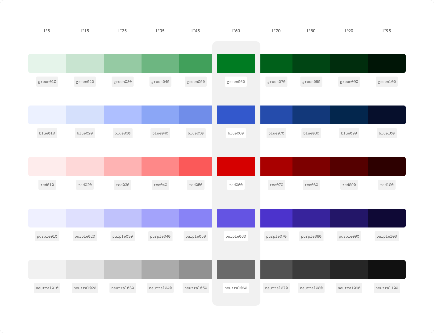
The L* values were defined across all the foundational palettes to ensure consistent lightness when used in both light and dark themes.
The highlighted colours are defined as the the interface defaults and scaling up or down from these defined ui elements for differing states.
The L* values were defined across all the foundational palettes to ensure consistent lightness when used in both light and dark themes.
The highlighted colours are defined as the the interface defaults and scaling up or down from these defined ui elements for differing states.
User research across the internal teams had identified that we had a significant number of consumers with disabilities so we made sure that all of the components were WCAG compliant and conformed to coding and accessibility standards.
I actively contributed to shaping every aspect of the core system, and I advanced this effort by guiding a technical solution for facilitating automated design-to-code updates to the token sets through NPM packages. This meant that the designers using the system no longer had to edit json files for theming to work effectively.
Once the theme setup was progressed, my role switched to one of support and education around the capabilities of the system. As the senior designer of the system I was able to educate the various levels of designers on not only the structure, but also the usage of the system and onboard new members to the teams across all markets.
I also ran weekly focussed drop in clinics where we fielded various questions that may arise through using the system. I was also able to prepare documentation and workshops that were presented in these pre-organised sessions.
A documentation file used in educating designers on the usage of new components in the system.
My contribution at a glance:
- Token definition
- Naming structure
- Token structure
- Theme defintion
- Onboarding and theme education
- Documentation
My contribution at a glance:
- Token definition
- Naming structure
- Token structure
- Theme defintion
- Onboarding and theme education
- Documentation
My contribution at a glance:
- Token definition
- Naming structure
- Token structure
- Theme defintion
- Onboarding and theme education
- Documentation
Create
Create
Create
The Figma libraries and the structuring of the system were always one of my prime responsibilities, and I led the evolution of the system and deployments.
We learnt a lot from our early structural explorations and further learnt what worked to support a truly multi branded system. As I had been key in the set up and definition of the theme and token structure, I was able to inform how best to iterate and evolve the core structural ecosystem.

NewsKit utilised a local component file for each brand to develop unique components and sections in addition to the default NewsKit components.
This meant that each brand could effectively manage their own components and still benefit from component updates and new releases from the core libraries.
As a team we managed the core system which consisted of the following:
- Theme files
- Component library
- Local design system templates
- Core icon library
When creating new components for the system, I was involved in all stages of the process and we functioned as an agile team.
My approach for additional components would be to follow the steps below and iterate on any stage that required further investigation:
- Requirement gathering from the teams NewsKit supported
- Assessment of brand usage to ensure consistency
- Engineering consultation on what’s required and documentation of the component
- UI assessment with team members to ensure correct approach
- Component creation with beta release
- Official release of component with release notes
As the component library grew, there were instances when certain components either evolved or became superseded. When this happened I was part of the team that would run communications and hands-on support for designers. The support I provided was in the form of drop in clinics, one to one walk throughs or group session workshops.
In the later stages of my involvement in the project, I managed the transition from our internal tooling for theme support over to Token Studio. This was identified as a key area where we could progress the system and provide further visibility of the token structure to designers.
It also allowed for us to closely align the components in design with our codebase, surfacing the tokens used in the construction of the UI components. With this transition it also allowed us to analyse the token structure and initiate any breaking changes as part of the major release.
We also looked to create an automated pipeline which I liaised with the engineers on. This enabled us to give the designers control of theme updates, reducing the reliance on engineers and provide further consistency across design and code.

Approval steps were introduced minimising unnecessary change requests when releasing updates in themes.
Approval steps were introduced minimising unnecessary change requests when releasing updates in themes.
Our solution enabled designers to push/pull the theme code from within Figma to Github (using the Token Studio plugin) and automatically publish an NPM package which could be directly consumed.
Scale
Scale
Scale
One aspect of NewsKit which we were particularly proud of was the documentation website. It was clear easy to read and a refresh of the design language helped us to become a known benchmark in the industry.

Documentation website showing the main component landing page
Documentation website showing the main component landing page
I was involved in the progression of the UI language and brand of NewsKit, helping to shape the sometimes complex content and component specification structure.
As a self initiator in any team I work in, I was able to see where our pain points were in the offline documentation, and produce a solution to aid designers.
An example of this would be the extensive documentation I created to help designers communicate with engineers any of the presets that may have been changed from the default component. All of this was set up to be driven by a Google sheet and allowed us to update the content of the documentation file in Figma automatically from the Google sheet.

Google docs was used to drive the content in the documentation of the presets.
These helped to communicate the presets used in each component, alleviating engineering friction when creating new components in the code base.
To further the adoption process and gain traction with the teams in News Corp, we were also involved in providing product solutions for common features across the business. I was responsible for the checkout solution, but we also developed an account area and a billing solution.
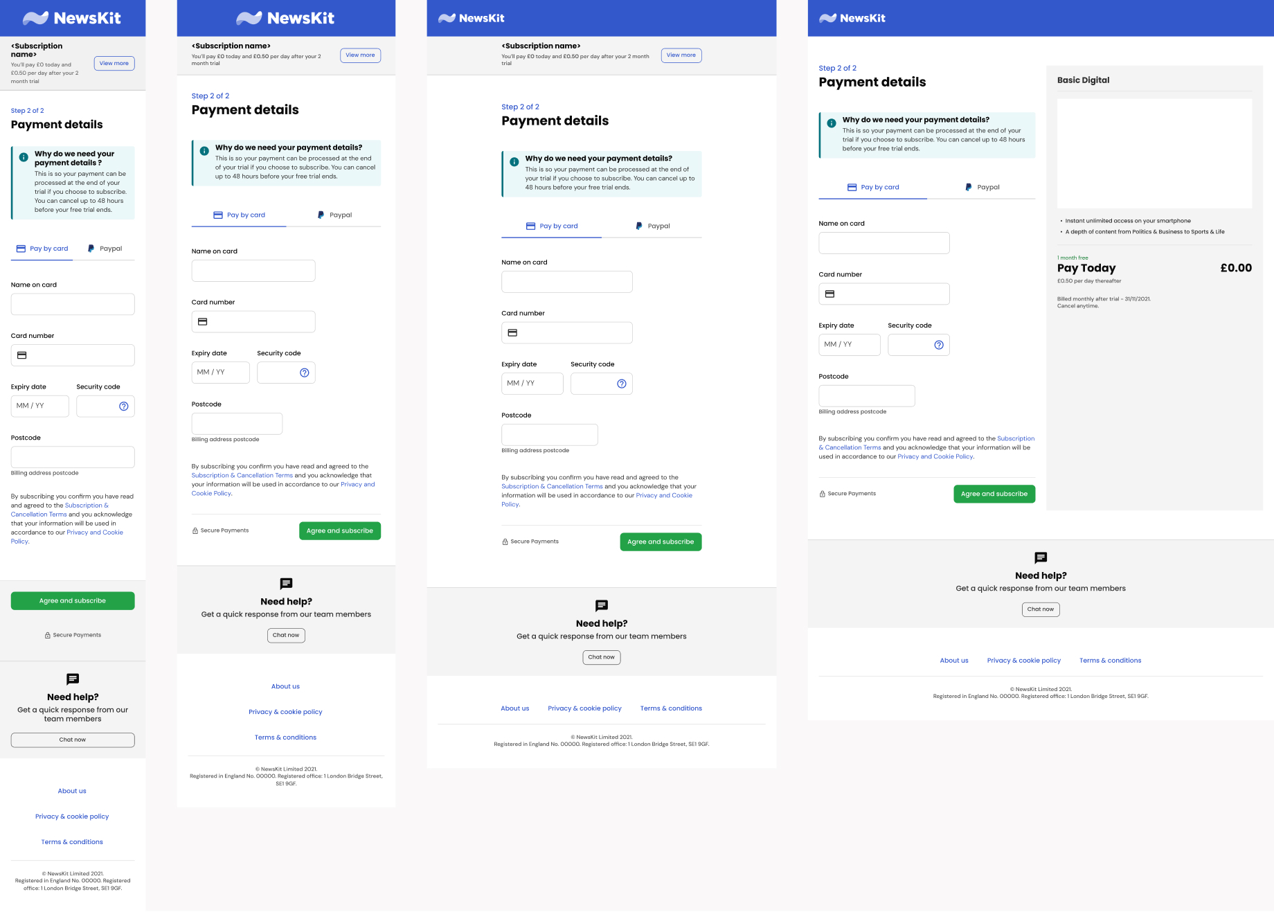
The checkout solution was built by the NewsKit API team using NewsKit components, and catered for all device types as the data showed a large percentage of users on smaller screen sizes.
We evaluated all of the unique solutions which were in use across the various silos at News Corp and set about creating a coherent UX/UI solution which catered for all the requirements of the various brands. All of these were of course built using NewsKit and it allowed us to showcase the capabilities of the system end to end.
As I’ve mentioned above we ran weekly sessions for teams to engage with us around any issues they may be encountering, and it was useful to see how the components were being used. Informing us of how to iterate on the component library and potentially re-engineer any unforeseen issues.
Our team was high functioning and performed more of a core design ops role for supporting the design teams using NewsKit. We managed tooling, design process and provided templates for effective project management along with utility libraries for common workflow usage. As part of the design ops role, I was embedded in The Sun team to help aid the adoption and practical usage of the system. This covered helping designers to set best practice approaches for using NewsKit on new projects and help in the transitioning of existing projects over to NewsKit. There was also the ongoing support for designers in Figma usage and setting up the theme with the publisher pipeline.


I'm available
Im currently looking for my next project to get stuck in to. Download my cv or get in touch.
I'm available
Im currently looking for my next project to get stuck in to. Download my cv or get in touch.
I'm available
Im currently looking for my next project to get stuck in to. Download my cv or get in touch.
I'm available
Im currently looking for my next project to get stuck in to. Download my cv or get in touch.
I'm available
Im currently looking for my next project to get stuck in to. Download my cv or get in touch.